The second baby was due the second week of June. My wife and I were about to disappear into the newborn fog for a while — the sleepless, hour-blurred stretch where two functioning adults become one and a half — and someone we trust was going to step in and run the house: keep our three-year-old fed and napped and happy, and keep three dogs alive and un-marked. That person is Raine. Raine is family, not paid help. She treats the kids and the dogs like her own.
So I built her a website. One link. Open it on a phone, and you can run my house. This is the story of that build, and — more to the point — the recipe, because the whole thing cost a free account, a domain, and an afternoon, and anyone reading this can make one for the person who's about to hold their house together.
The take, first
The failure mode of "here's everything you need to know" is a binder. A thick, lovingly-made binder that nobody opens at 5pm with a toddler melting down and a dog crying at the back door. The information is all in there. It's just not reachable in the one-handed, kid-on-your-hip, why-is-it-so-loud moment when you actually need it.
So I didn't build a binder. I built something that answers exactly one of four questions, fast, and refuses to do anything else:
- What's happening right now?
- Where is the thing I need?
- What does the three-year-old mean by that word?
- What do I do if something goes wrong?
If a screen doesn't serve one of those four questions, it's bloat, and it got cut. That constraint is the entire design. Everything below is downstream of it.
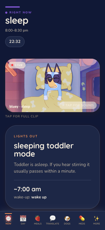
That's the home screen. It opens on right now — the current thing that should be happening, a countdown to the next thing, and whatever you'd need to survive this specific block of the day. No dashboard, no login ceremony, no twelve tiles. The question a tired person actually has when they pull out their phone is "what am I supposed to be doing this minute," so that's the first and biggest thing on the screen. Everything else is one tap away on the bar at the bottom.
Who it's really for
I want to be precise about who I was designing for, because it changes every decision.
The design brief describes the person holding the phone: standing in a kitchen, or at a baby gate, following a three-year-old around. One hand on the phone, the other doing everything else. The kid is mid-tantrum. She is tired, sometimes overwhelmed, occasionally a little panicked. And then the line I kept taped to the front of my brain the whole build:
The site should never make her feel dumb.
That's the whole job. Not "comprehensive." Not "impressive." Never make the tired person feel dumb. Every choice — the giant tap targets, the plain words, the fact that the scariest page opens with reassurance instead of instructions — comes out of that one sentence.
Which meant the voice had to be right, and "right" here specifically means not soothing-corporate. The tone spec bans platitudes outright — "soft voice, slow hands" is a literally-banned phrase — because that register reads as a stranger talking at you, and it evaporates the second things get real. I write the way I talk, so the handbook talks the way I do. When it tells you a dog is going to be a problem, it says the dog is going to be a problem.
The heart: a toddler-to-English dictionary
Here's the page that gives the whole thing away as made-by-someone-who-actually-lives-here.
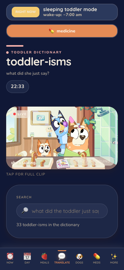
A three-year-old speaks a private language, and if you don't have the decoder you will spend your day failing her in ways that make you both cry. So there's a Translate page: a real, searchable dictionary of the things she says and what they actually mean. Dozens of entries. "Cut it" means cut into quarters, not halves — halves are an outrage. A specific word means the orange cheese puffs, and a different word means actual popcorn, and confusing them is a betrayal. "Blue juice" means one specific pouch, two maximum, and — the handbook notes helpfully — she will then need to pee.
There's even an entry flagged as taboo: a word you do not say out loud in her presence, that you spell instead, because saying it commits you to a thing you may not be able to deliver. If you know, you know. If you don't, the dictionary saves you from an afternoon you didn't see coming.
That page is the emotional core of the whole project, and it's also the proof of what these things are for. You cannot Google "what does my friend's kid mean by that." It only exists in the heads of the two exhausted people who made her, and the entire point of the handbook is to get it out of our heads and onto a phone the caregiver already has in her hand.
The scariest page opens with a breath
The one place I broke every "keep it short" rule was the medical page, and I broke it on purpose in the other direction — toward reassurance.
Our three-year-old has had a febrile seizure. If you've watched a small child seize, you know that no amount of "the medication works" printed on a page fully prepares you. So the emergency page doesn't lead with a protocol. It leads with a sentence: breathe — it looks worse than it is, you can do this, the medication works. Only then does it walk through what to actually do, and at the step that terrifies people — administering the rescue medication — it says, plainly, it's easier than you'd think; from experience, just do it.
That "from experience" is doing a lot of quiet work. It's not a doctor's language. It's a parent telling another caregiver we have stood exactly where you're standing, and you will get through it, and here's the hand on your shoulder. I'm not going to screenshot that page — where the medicine lives and what the doses are is the family's business, not the internet's — but I'll tell you the design principle, because it's the transferable one: the more frightening the moment, the more the interface's first job is to calm the human, and only its second job is to inform them. A wall of medical instructions to a panicking person is technically correct and practically useless.
The medicine page is also, deliberately, the one page guaranteed to load even with no signal — more on that below. The emergency content has to be the most reachable thing, not the least.
The parts that keep everyone alive and fed
The rest is the daily machinery, and it's where the "answer one question, fast" rule earns its keep.
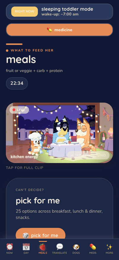
Meals isn't a recipe book. It's decision relief. The rule of thumb sits right at the top — a fruit or veggie, a carb, a protein, done — and then there's a "pick for me" button that just chooses, because the actual problem at mealtime isn't a shortage of options, it's decision fatigue while someone tugs your leg. Every idea is a card with the detail that matters and none of the detail that doesn't. There's a note about which donuts to get and where in the store they hide. That's the texture of a real handbook: not "provide balanced nutrition," but "the good donuts are at the front by the registers, and they know what they're doing."
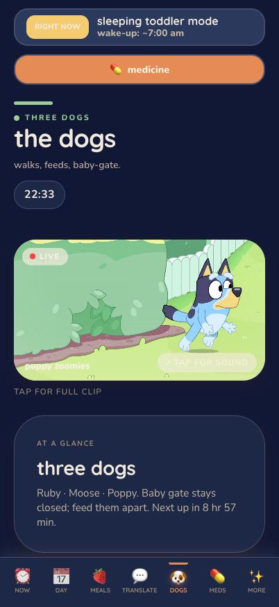
Dogs is three profiles, and it does not soften them. One dog is the sensible, aloof, cat-like elder. One is the world's best cuddler who will, if you blink, mark everything he can reach — pure instinct, no malice, still your problem. One is the youngest, who will cry like she's being skinned alive the instant she thinks she's alone. You need to know all three of those things before they happen, not while they're happening, and each profile carries the feeding rules, the quirks, and the specific contingency for when it goes sideways. The honesty is the usefulness. A page that told Raine all three dogs are "good boys and girls" would be lying to her in a way that costs her a ruined carpet.
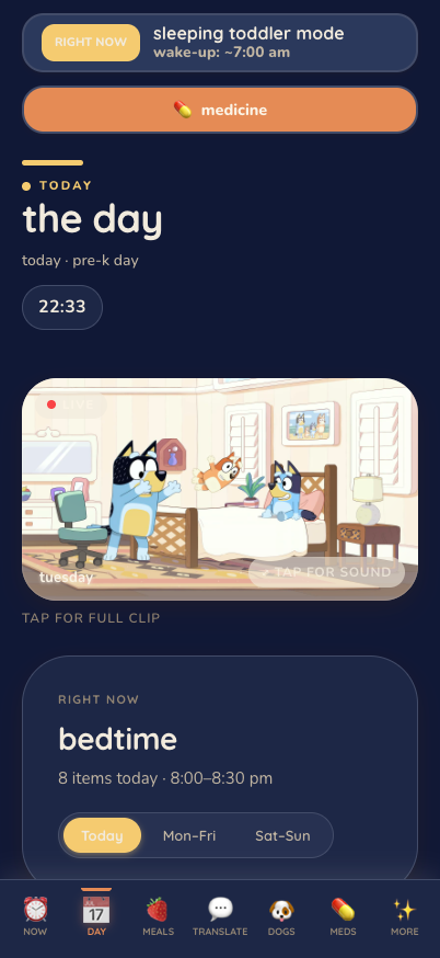
The Day is the full timeline when you want it — wake to bedtime, with the weekday-versus-weekend fork built in, because a pre-K drop-off day and a free-play Saturday are different animals. The notes in it are candid in the way only a parent's notes are: one line about the 5am wake-ups just says (god help us all), and the nap-time guidance warns you, in writing, not to let her cuteness win the argument about whether she's tired. That's not documentation. That's a friend leaning over and telling you the one thing that'll save your afternoon.
The Bluey of it all
Now the part that turns a utility into a gift.
The whole thing is themed in real Bluey — actual frames and clips from the show my kid loves, from my own media library, pinned to the right places. The sleep zone gets the Sleepytime episode. The meals page gets the fancy-restaurant one. There's a little floating mascot you can tap to play a clip — "a tale" — as a thirty-second release valve when everyone needs to reset. And the entire app tints itself to the time of day: it warms up at dawn, goes bright and busy midday, softens through the evening, and settles into the deep blue you can see in these screenshots at night. When Raine opens it at 10pm, it feels like 10pm.
None of that serves the four questions. All of it serves the one sentence: never make her feel dumb — and its warmer cousin, make her feel held. A spreadsheet manages a person. A soft, familiar, kid's-show-colored little app at least tries to keep her company. The cartoon their kid loves, painted over everything, is the difference between a tool and a kindness.
The one genuinely important technical trick
I'll keep the stack honest and short, because the whole pitch is that you don't need to be me to do this. It's a small single-page app — Vite, React, TypeScript, some motion, a fuzzy search box, self-hosted fonts — about 10,400 lines across 95 files, built over roughly three and a half weeks and finished, per the last commit, right before the baby arrived. It installs to a phone's home screen like a real app. That's it. It is not clever, and it doesn't need to be.
The one part that does deserve care is privacy, and it's the part I'd beg you not to skip.
A handbook like this is a concentrated pile of exactly the things you don't want on the open internet: your home address, your door code, your daycare's code, your kid's medical specifics, a map of which room your child sleeps in. The naive way to build this is to type all of that into the app's pages — and if you do, it ships inside the app's downloadable code, where anyone who finds the URL can read it straight out of the files. Invisible on screen, plainly there in the source. That's the trap.
So none of the crown-jewel data lives in the code at all. The app is just a render gate. The moment you actually need the sensitive stuff, it's fetched at request time from behind a login — invite-only, so only the specific people I invited can even get a session — and the truly sensitive values (the address, the door codes) don't sit in the project either; they live in server-side environment variables and get injected only into an authenticated response. If you open the app without being invited, those fields simply aren't there to find. The screenshots in this post are from a built-in demo mode that renders the whole thing with the real content swapped for placeholders — which is exactly why I could publish them: the demo says "the toddler" and "she," never a name, and the address and codes come through as obvious dummies.
And one more thing that matters more than it sounds: the app caches the last good version locally, so if the network drops or the session expires while Raine is standing in my kitchen, it re-renders what it last knew and tells her, honestly, how old that is. The emergency medical page is bundled to be reachable first, offline, always. A handbook that needs a perfect connection to show you the seizure protocol is a handbook that fails at the exact moment it exists for.
The "anyone can do this" recipe
Here's the part I actually want you to take. Strip away my particular stack and the copyable spine is short:
Start from the list you already keep. We already had a shared Google Sheet — the kid-and-dog schedule. The website is just that sheet, reorganized to answer the four questions instead of sitting in a grid. You almost certainly already have the raw material in a Note or a Sheet somewhere. The work is arrangement, not invention.
Pick your four questions. Ours were what now / where is it / what does she mean / what if. Yours might differ. Write down the four things your caregiver will actually ask under stress, and build only for those. Everything else is the binder nobody opens.
Any tool works. I used React because it's what I reach for, but the idea — one link, phone-first, glanceable, big buttons — needs no framework at all. A single well-organized HTML page carries the entire heart of this. Do not let "I don't know React" stop you; it is not the point.
Keep the private stuff out of the code, behind a login. This is the one non-negotiable. Addresses, door codes, medical details — put them behind an invite-only login and, if you can, in server-side config rather than in the pages themselves. A free hosting account covers this. If that sentence sounded like gibberish, the safe version is even simpler: don't put your address or door code on a public web page, and password-protect the whole thing.
Write it in your own honest voice. The contingencies are what make it useful under pressure — "the dogs will lose their minds, cage them fast"; "it's easier than you'd think, just do it." Ban the platitudes. The specific, slightly-too-honest note is worth ten reassuring-sounding ones.
Theme it for warmth. Bluey, for us. For you, whatever your kid loves and whatever makes the tired person feel accompanied instead of audited. This is the step people skip because it feels frivolous. It is not frivolous. It's the difference between a chore and a gift.
Make it survive a bad moment. Cache it for offline. Put the emergency information where it loads first and fastest. The whole thing exists for the worst five minutes, not the good ones.
Total cost: a free hosting account, a domain if you want a pretty link, and an afternoon. That's the actual barrier. It's low. That's the whole reason I'm writing this down instead of just quietly enjoying that it worked.
What it was really for
The baby came. The house kept running. Raine ran it — fed the kid, kept the dogs apart, decoded the private language, never once had to text us "wait, where's the—" while we were somewhere between a hospital and no sleep. The handbook did its job, which was never really "store information." It was to let one tired, generous person walk into a house that isn't hers and feel, immediately, like she had a map and a hand on her shoulder.
That's the thing I'd leave you with. The code here is trivial. The screenshots are cute. But the reason to build one of these isn't the build — it's that somewhere out there is a person about to hold your whole world together for a few weeks while you're underwater, and you can hand them one link that says, in your own voice, you've got this, and here's everything you need, and none of it will make you feel dumb. An afternoon for that is the best trade I made all year.
Cheers, Chris